Libby - bringing warmth to digital reading.
Libby mobile app redesign case study
Role
Product Design
User research
Tools
Figma, FigJam, Canva
Project Overview
The Digital Library Companion
Libby is a beloved public library application used by millions to borrow ebooks and audiobooks for free. While the core utility of Libby is highly appreciated, user research revealed usability bottlenecks that hindered user flows and active title management.
Redesign Objectives

Simplify book discovery paths
Clarify loan statuses & holds timeline
Create cohesive brand aesthetics & delight
THe RESEARCH
Understanding the Readers
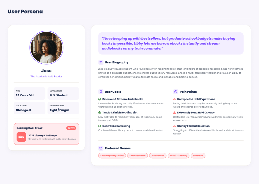
I conducted user research to understand how readers interact with Libby, identifying the moments of friction and the features that matter most to their borrowing experience.
User Interviews
8 in-depth interviews with regular Libby users revealed common pain points and goals.
01
Discovery friction
“I spend too much time scrolling through lists to find something I actually want to read.”
02
Hold uncertainty
“I never know when my hold will actually become available. It feels like a mystery.”
03
Recommendation desire
“I wish Libby could suggest books based on what I’ve already borrowed.”
04
Library card management
“Switching between library cards is tedious. I wish it felt like one unified library.”
Competitive Analysis
A benchmark against popular reading apps highlighted opportunities for Libby to lead in discovery and hold management.
Feature
Libby
Kindle
Audible
Hoopla
Unified Search
✓
✓
✓
✓
Hold Queue Visibility
✓
—
—
—
Personalized Recs
✓
✓
✓
✓
Multi-Card Management
✓
—
—
✓
Key Findings
The most critical insights that shaped the redesign priorities.
01
Borrowing flow confusion
78% of users found the current borrowing flow confusing, especially when switching between formats and library systems.
02
Discovery fatigue
Users wanted a cleaner home feed that prioritizes personalized recommendations over repetitive lists.
03
Hold queue visibility
Hold queue visibility was the top requested feature to reduce anxiety and missed checkouts.
04
Multi-card management
Users manage multiple library cards and wanted a single, unified view to compare availability across systems.
The Problem
What needed fixing?
Based on interviews and contextual inquiry with active readers, we isolated three critical friction areas that impacted the daily borrowing experience.

Cluttered Discovery
The home shelf forced many confusing lists onto a single view, overwhelming users and leading to search fatigue.

Obscure Hold Timelines
Estimating when a high-demand book would become available was guesswork, resulting in forgotten holds and expired checkouts.

Siloed Library Cards
Managing multiple library systems was laborious. Users struggled to see which system offered the shortest waitlist.
Translating Insights to Wireframes
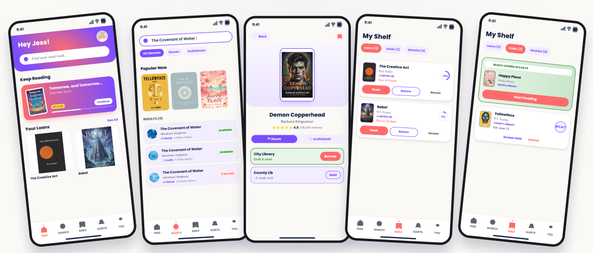
I mapped out a 5-screen wireframe user flow focusing on structural clarity and simplified navigation before diving into brand colors.
9:41

Home Dashboard
Grayscale Wireframe
9:41
Search & Filters
Grayscale Wireframe
9:41
Book Details
Grayscale Wireframe
9:41
Shelf (List view)
Grayscale Wireframe
9:41
Shelf (Detail view)
Grayscale Wireframe
Information Architecture
The Simplified 'Borrow a Book' Flow
A user journey mapped out to minimize clicks. Users now find, verify availability, and confirm holds or loans with minimal friction.
STEP 01
Home Feed
Personalized reading progress and smart notifications.

STEP 02
Unified Search
Simultaneous check of all linked library card databases.
STEP 03
Availability Check
Instant comparisons of wait times across systems.
STEP 04
Book Detail Page
Clear formats (Ebook vs Audio) with direct action triggers.
STEP 05
My Shelf Update
Consolidated overview of current holds, expires, and loans.
Bringing Warmth to Digital Reading
By pairing Poppins' vibrant typography with warm coral and violet gradients, the interface moves from utility-only to an engaging and delightfully immersive digital environment.
9:41

Hey Jess!


Find your next read...
Keep Reading

Borrow
Hold
9:41
Hey Jess!

Find your next read...
Smart Search
Borrow
Hold
9:41
Hey Jess!

Find your next read...
Covenant of Water
Borrow
Hold
9:41
Hey Jess!

Find your next read...
Holds List
Borrow
Hold
9:41
Hey Jess!

Find your next read...
System Priority
Borrow
Hold
Layout Design Decisions
A deep dive into specific layout decisions that removed historical friction points.
9:41
Hey Jess!

Find your next read...
Home Dashboard
Borrow
Hold
Smart Header & Search
A
Unified Search Area
Placed inside the header gradient to maintain instant, top-level reachability across the app.
B
Delightful Avatar Portal
Quick access to user accounts, library cards, and total monthly reading goals in one spot.
9:41
Hey Jess!

Find your next read...
Hold Estimations
Borrow
Hold
Waitlist Clarification
C
Visual Availability Chips
Quick indicators showing book wait times as calendar blocks instead of complex numerical ratios.
D
Universal Hold Actions
Allows readers to snooze holds without losing their waitlist rank, ensuring complete schedule flexibility.
Final Designs
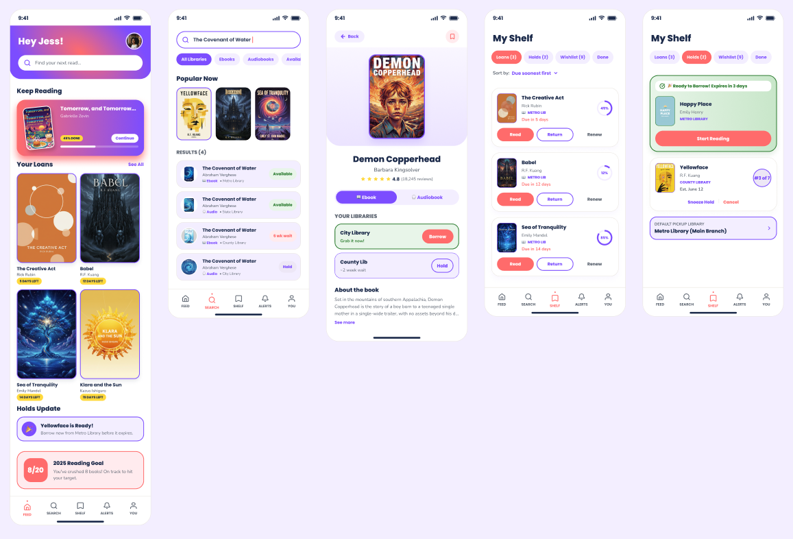
Outcomes
Results & Takeaways
The redesign was simulated with Libby power users, scoring high across overall usability ratings.
Improved Discovery
Users found their next checkouts significantly faster due to the consolidated system search interface and reduced feed clutter.
Hold Expirations
Clear countdown markers and the hold-snoozing flow greatly reduced missed waitlists and expired checkouts.
Aesthetic Delight Rating
Gradients and serif typography headers gave the library experience a premium feel, increasing daily check-in habits.