Before
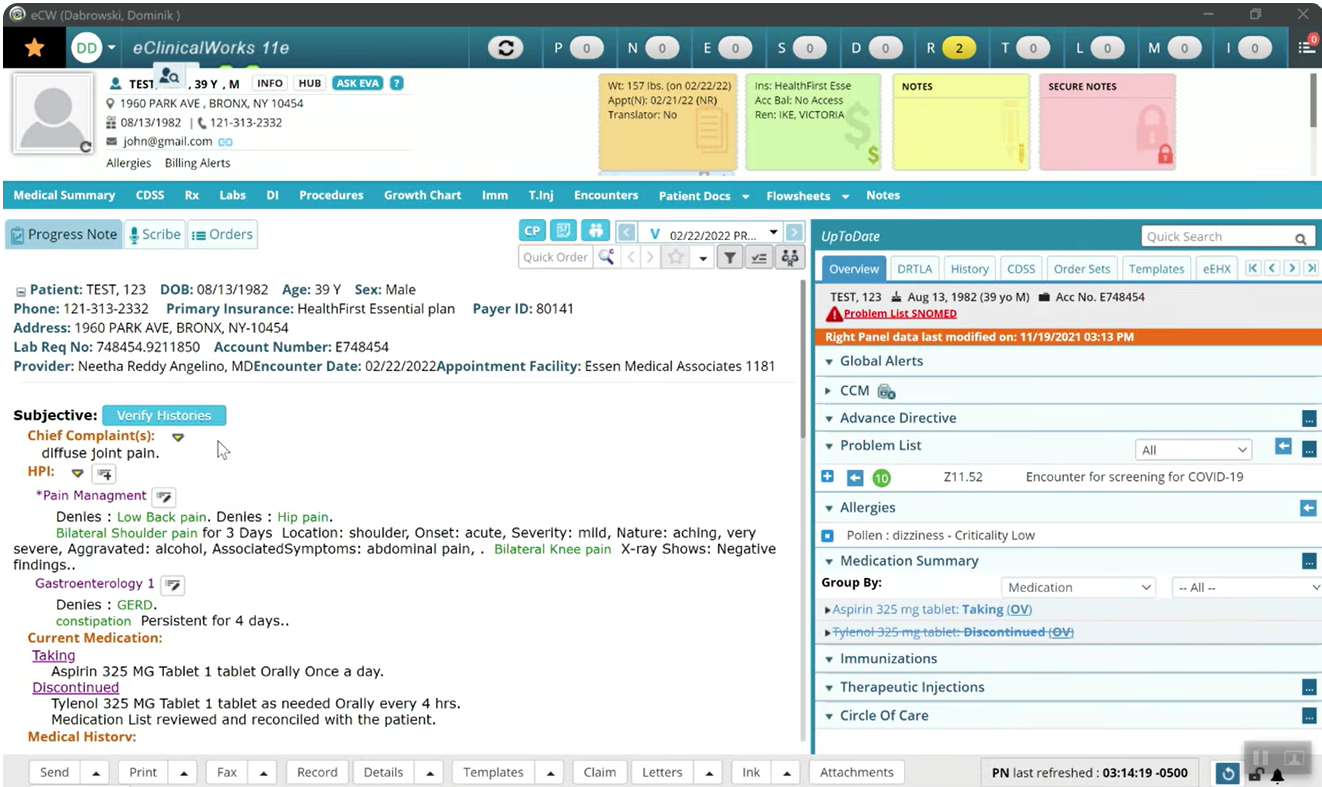
- Frequent screen switching to complete tasks.
- Important patient information is hard to locate.
- Progress note does not follow common clinical workflows.
- Cognitive overload from visual clutter.
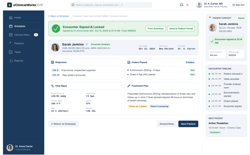
- Lack of visual confirmation that the documentation was completed.
After
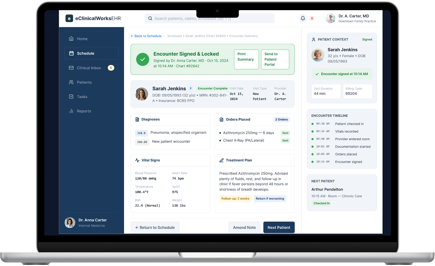
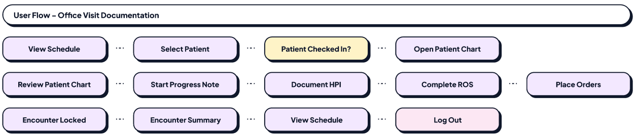
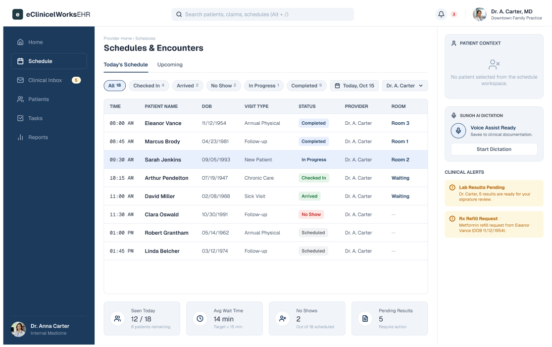
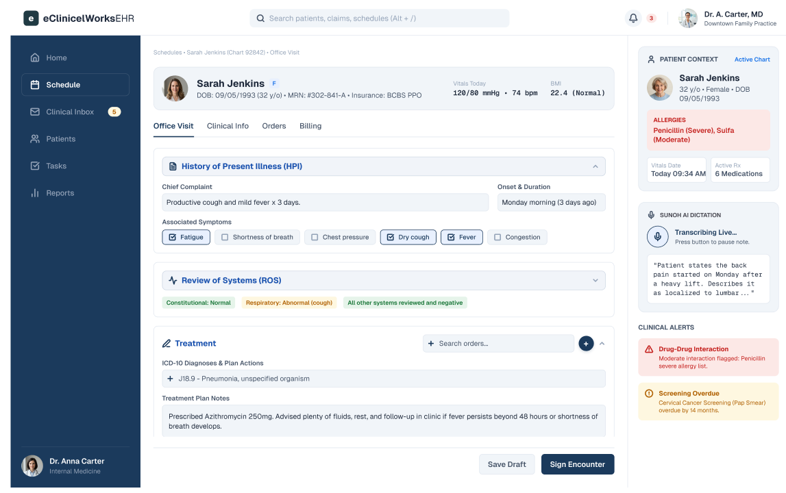
- Simplified office visit user flow.
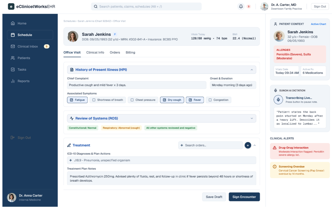
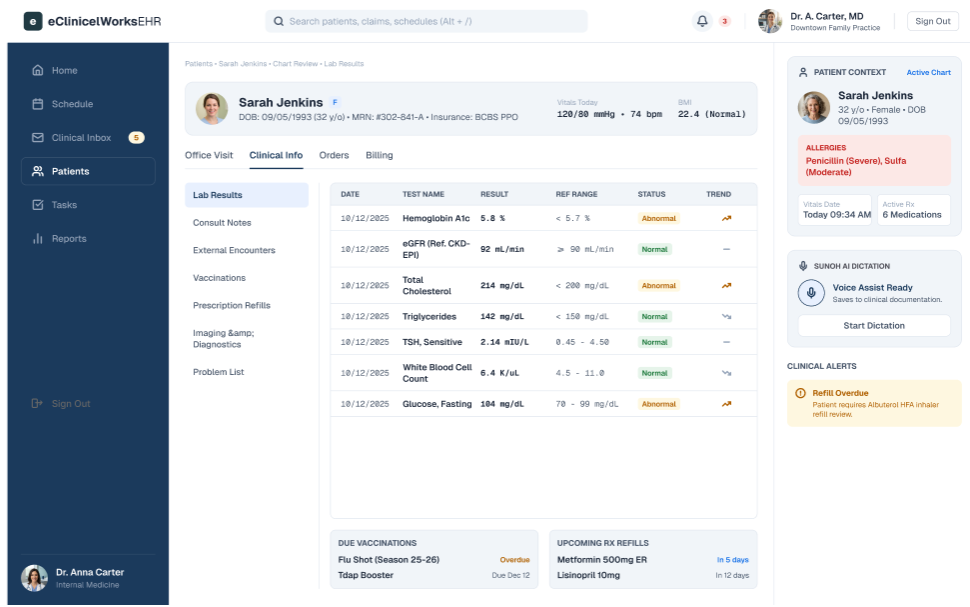
- Appropriate information architecture to make clinical alerts and patient information easy to locate.
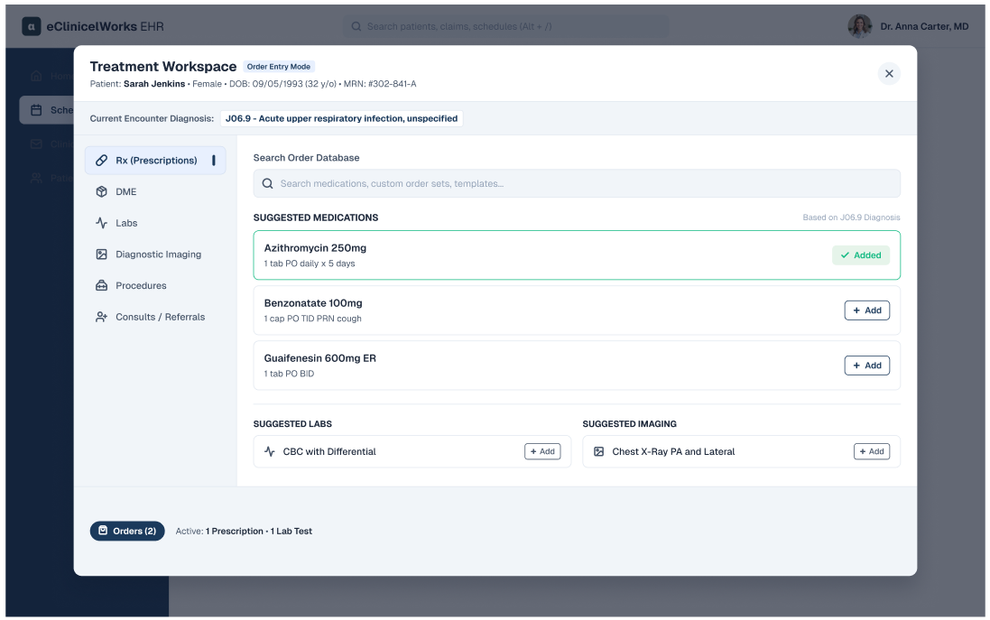
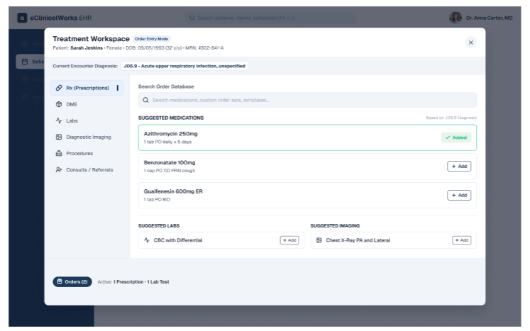
- Reduced screen switching to complete related tasks.
- Reduced visual clutter to reduce cognitive overload.
- Visual confirmation of required tasks completed.
Insights
Problem 1
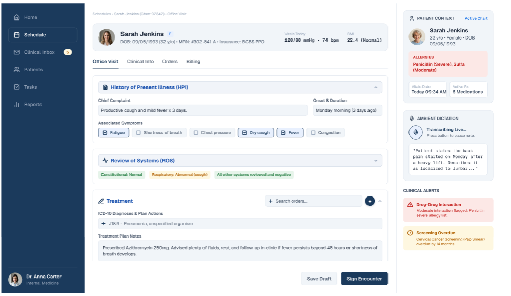
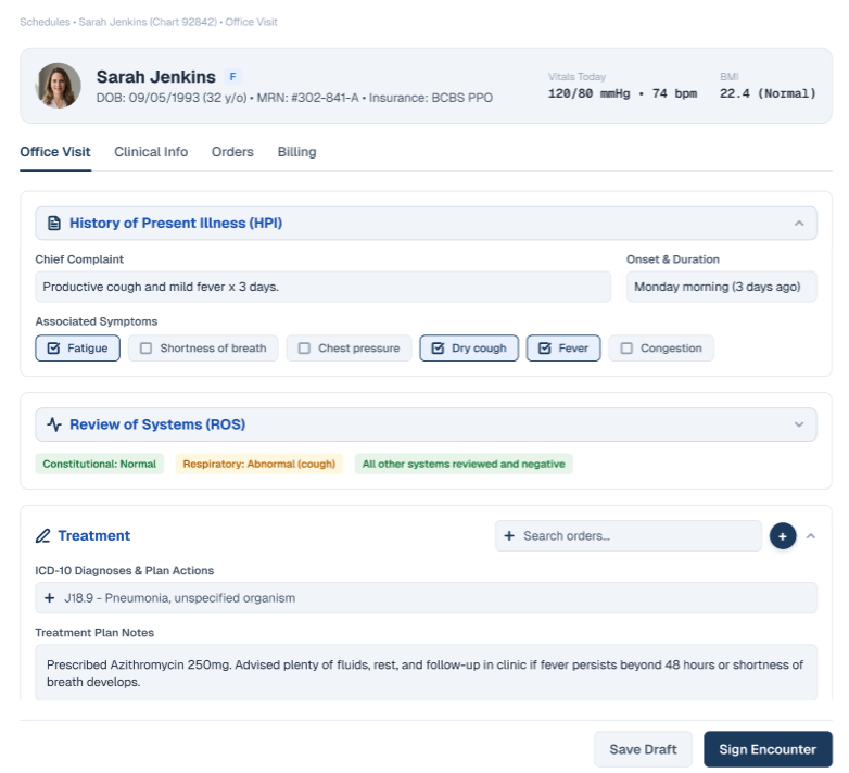
- Cognitive overload from a busy user interface with too many option and inconsistent information architecture
Solution 1
- Simplify the patient’s office visit screen to reduce time spent screen switching.
- Creates a less stressful process for providers to enter clinical documentation and information required for billing and insurance purposes.
Problem 2
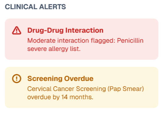
- Patient information and clinical alerts are hard to locate
Solution 2
- Improve information hierarchy to reduce visual clutter.
- Reduce clicks to locate patient information and clinical alerts.

Problem 3
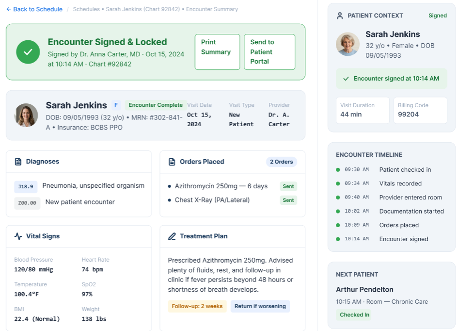
- No visual confirmation of office visit completion or orders placed during the visit.
Solution 3
- Summary of visit details and orders placed during the visit.
- Visual confirmation of completed patient visit.
Research Goals & Methods
- Understand how physicians navigate the eClinicalWorks office visit workflow and identify usability challenges that delay encounter completion.
- Conducted in-person and virtual user interviews with providers to understand their documentation workflows and daily challenges.
- Observed providers complete office visits in eClinicalWorks in-person and virtually via Zoom.
Key Findings
- Research identified excessive clicks, fragmented navigation, difficult-to-find patient information, and visual clutter as the primary sources of provider frustration. These usability issues increased documentation time, cognitive load, and workflow interruptions during office visits. These issues resulted in several visits that were not billable to insurance.
User Insights & Pain Points
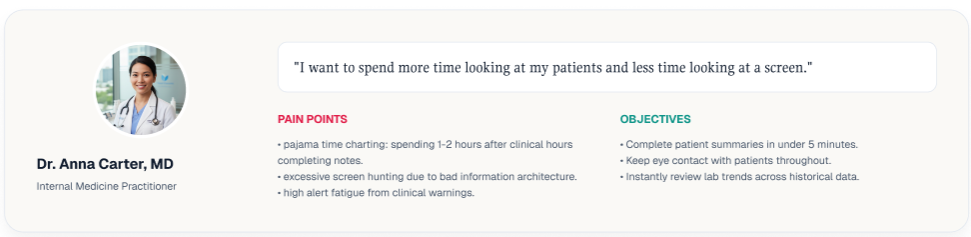
- Providers need an interface that supports their workflow instead of forcing them to adapt to the system's structure. Simplifying navigation, improving information visibility, and reducing unnecessary interactions can help improve documentation efficiency and overall usability.
- Providers need to quickly access relevant patient information, complete documentation with fewer steps, and move through office visits without unnecessary interruptions.
User Persona

The Design Process
Wireframes
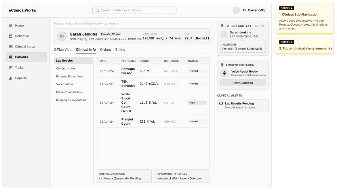
After identifying user pain points, I set out to create wireframes in Figma to explore solutions to simplify the user workflow. Each design decision focused on reducing unnecessary clicks, improving access to critical patient information, and creating a documentation experience that aligns with providers' natural workflow.
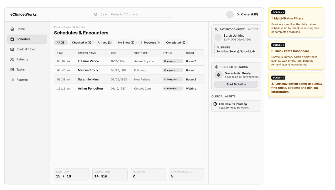
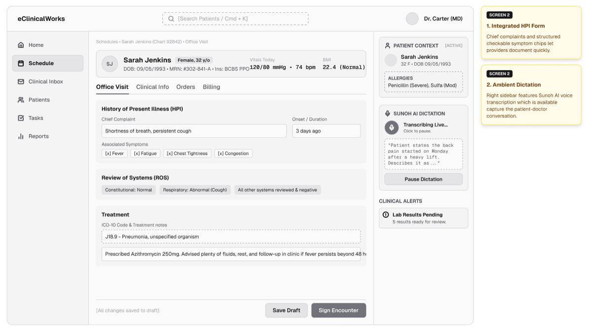
Provider schedule and office visit mid-fidelity wireframes
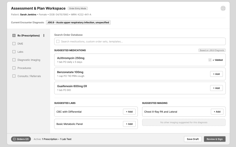
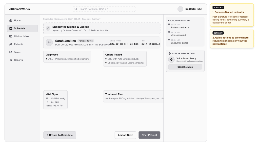
Translating wireframes to designs and prototypes
Final Designs After User Feedback

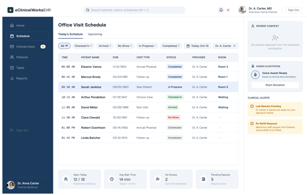
Previously providers had to click on their name in eClinicalWorks to access to log out option. After usability testing, a quick access sign out button was added to the final design.
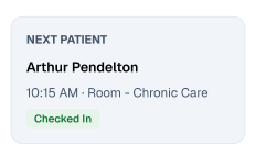
A “Next Patient” feature was added to the office visit summary/sign-off confirmation screen per feedback after user feedback.
Takeaways
I chose to do user interviews and in-office observation as my user research methods due to their suitability for a small user group. In the future, I hope to include competitive analysis and A/B testing to gain more comprehensive insights for better design decisions.